

Rainlendar
About Rainlendar
The calendar applications most people use day to day are full-window applications you open when you need them. Outlook, Thunderbird’s Lightning, the Calendar app that ships with Windows, the various web calendars, all of them require a deliberate action to look at your schedule. You stop what you are doing, you switch context, you see your events, you close the window, you go back to whatever you were doing.
Rainlendar takes a different approach. It puts the calendar directly on the desktop, as a transparent skin that sits behind your application windows or on top of them, depending on how you configure it. You can see today’s date and this week’s events without switching context, because the calendar is always there, embedded in the same visual space as your wallpaper.
The interaction model is closer to a desktop widget than to a calendar application, and that single design choice is what makes it useful for some workflows and useless for others.
The panels and what living on the desktop actually looks like
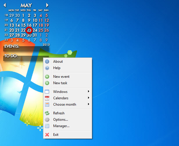
Out of the box, the application places two panels on the desktop. A month calendar shows the current month with today highlighted and any scheduled events marked on their dates. An event list panel below or beside it shows upcoming items in chronological order, with the next few days expanded and the further future condensed. A separate todo panel can be added for tasks rather than scheduled events.
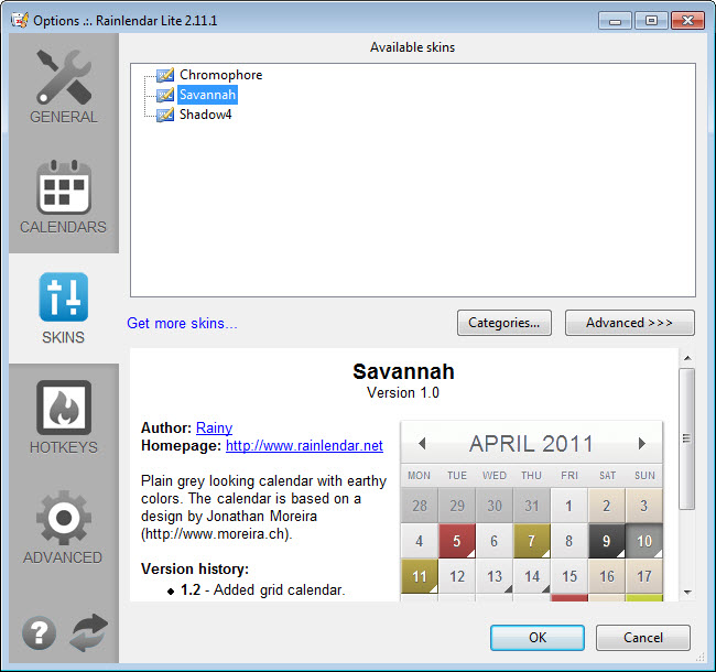
The panels are skinned, meaning their visual appearance is controlled by skin files that define colors, fonts, backgrounds, transparency, and layout. The default skin is functional and tasteful, the community gallery provides hundreds of alternatives ranging from minimalist to elaborate, and skin authoring is approachable enough that users with patience can produce their own variations.
For users coming from the 8GadgetPack world of sidebar gadgets, the skin model will feel familiar, the application is essentially a calendar gadget with much more configurability than the sidebar tools ever offered.
The panels can be locked in place or freely repositioned. They can be set to always stay on top, always stay behind other windows, or only appear when you press a hotkey. The “behind everything” mode is the popular one, the calendar lives on your wallpaper and is visible whenever you minimize your windows or look at an empty desktop area.
Lite versus Pro, the distinction that matters
This is where many users get tripped up. The free Lite version handles local events well, supports the skin system, runs on the desktop as advertised, and is genuinely useful for someone whose schedule lives entirely in this one application. What it does not do is sync with anything external. Google Calendar, Outlook, iCloud, Nextcloud, CalDAV, none of it works in the Lite version.
The paid Pro version is where the sync features live. iCalendar (ics) format support means you can subscribe to any standard calendar feed (public schedules, sports calendars, holidays, project calendars). Direct Google Calendar sync, direct Outlook sync, CalDAV support that covers iCloud and most third-party calendar services.
Multiple calendar profiles so you can keep work and personal events visible but distinguishable. Background syncing so changes you make in your phone’s calendar app appear on the desktop without manual refresh.
For users whose calendar already lives somewhere else, this is the practical line. Lite is a local-only tool, Pro is the bridge from your desktop to your existing calendar ecosystem. The license is one-time purchase rather than subscription, which is unusual in this category and worth noting.
For users whose primary calendar lives inside an email client, eM Client integrates the two in a single application, but that approach replaces your email client rather than adding a desktop layer over whatever you already use. The trade-off depends on whether you want one application that does both or two that work alongside each other.
Event creation, categories, and recurring schedules
The event creation dialog covers the standard set you would expect. Title, location, description, start time, end time, all-day toggle, color-coded category, alarm with configurable lead time and sound. Recurring events support daily, weekly, monthly, and yearly patterns with custom intervals (every two weeks on Tuesday, the third Friday of every month, every weekday except Wednesday).
Recurrence exceptions are handled, so a weekly meeting that gets moved one specific week stays moved without breaking the rest of the series.
Categories are essentially tags with colors. You define which categories exist, assign a color to each, and tag events accordingly. The event list panel can be filtered by category, and the month view shows events colored by their category, making it easy to see at a glance whether the day is dominated by work, personal, family, or whatever divisions you use.
Drag-and-drop event movement works as expected, you grab an event and drop it on another date, the event moves. For a tool whose interaction model is mostly visual, this matters more than it would in a window-based calendar.
To-do tasks and the difference from events
The to-do system is separate from the event system. A task has a title, optional description, optional due date, priority, and category, but no specific time of day. It sits in the to-do panel until you mark it complete, at which point it either disappears or moves to a completed list depending on your settings.
This is a deliberate design choice that not everyone agrees with, some users want tasks and events on the same timeline, others want them strictly separate. The application takes the strict-separate position. Tasks with due dates do appear in the month view as small indicators, but the primary task interface is the dedicated panel.
For task management at a higher level of sophistication, dedicated to-do applications offer more (subtasks, priority queues, project organization, kanban views), but for the use case of “I have a list of things to do this week and want to see them on my desktop,” the built-in system is enough.
The weather panel and the smaller extras
Pro adds a weather forecast panel that pulls from online sources and displays current conditions and a multi-day outlook. The information is the same forecast data your phone already shows, but having it on the desktop in the same visual context as the calendar consolidates two glances into one. The panel is skinnable like the rest of the interface, so it can match the calendar’s visual style or stand out depending on your taste.
Smaller extras include lunar calendar display, multi-country holiday support (you can show holidays from several locales simultaneously, useful for users with international family or work obligations), a notes panel for free-form text, and an event search that runs across the local database and synced calendars. None of these are revolutionary individually but together they extend the desktop-as-information-surface idea consistently.
For users who want to put quick notes on the desktop alongside the calendar rather than inside the application itself, 7 Sticky Notes handles the freeform-note side better, and the two tools coexist comfortably on the same desktop because they occupy different visual layers.
Sync, conflicts, and what online integration actually feels like
For Pro users syncing with Google Calendar or Outlook, the experience is broadly smooth but not invisible. Sync runs on a schedule you configure (every few minutes, on demand, on application start), and changes propagate in both directions, an event created on your phone appears on the desktop within a sync cycle, and an event created on the desktop appears in your phone’s calendar app.
The catch is conflict resolution. When the same event is edited on both ends between syncs, the application has to decide which version wins, and the rules for that are not always obvious to users who have not read the documentation.
The usual outcome is that the most recent change wins, but exceptions exist for specific edge cases (deletions versus edits, recurring event exceptions, all-day versus timed). For users with a single primary calendar tool and the desktop as a viewer, this rarely matters. For users actively editing in both places, occasional weirdness is the cost.
CalDAV support is where the application earns its keep for users who care about avoiding lock-in to specific calendar services. Any CalDAV-compatible server works, including self-hosted options like Nextcloud, which means the calendar data does not have to live in a major cloud service if you would rather it not.
The interface and the configuration depth
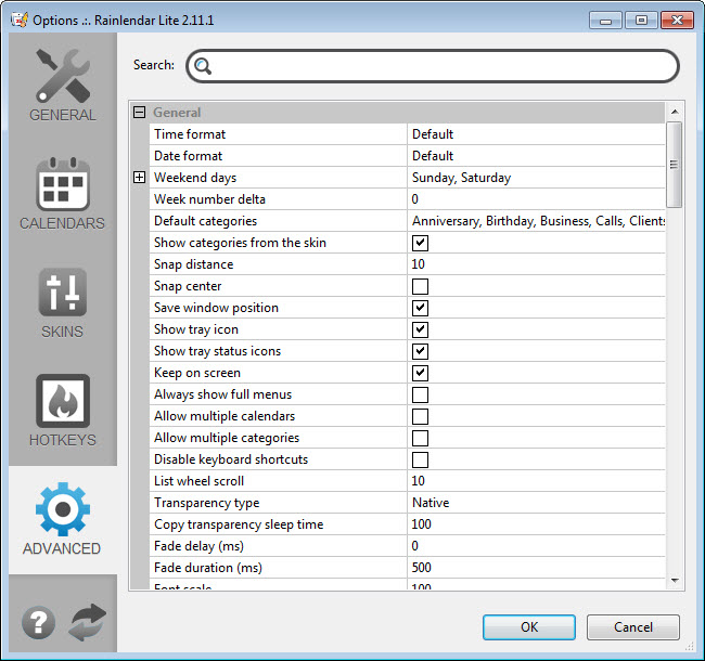
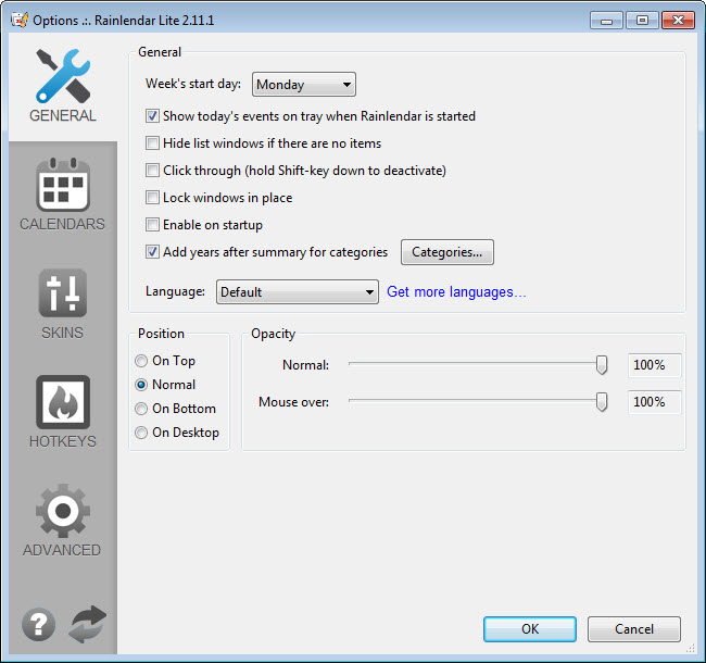
The settings dialog is dense. Hundreds of options spread across multiple tabs covering display, behavior, calendars, categories, alarms, skins, hotkeys, locales, sync, and more. The defaults are sensible, you do not have to touch most of these to use the application, but the configurability is what makes it adaptable to widely different workflows.
This is the place where users either appreciate the depth or feel overwhelmed by it. The application assumes some patience for tweaking, and the right approach for new users is to install, leave most settings alone, identify the two or three things that bother you, and adjust only those. Trying to configure everything from scratch on day one is the path to frustration.
The skin gallery on the project’s site is worth browsing once you have used the default for a few days. The visual difference between a default skin and a well-chosen alternative can dramatically change how present the calendar feels on the desktop, from “always visible information surface” to “subtle reminder in the corner of the wallpaper.”
For users whose desktop email client already provides a calendar (Thunderbird with Lightning, for example), Thunderbird handles the integrated email-plus-calendar use case in one window. The choice is whether you want the calendar as part of your email environment or as a separate always-visible desktop layer, neither is wrong, the answer depends on your habits.
Conclusion
Rainlendar is the right tool for users who want their calendar to be part of the desktop rather than a destination they visit. The desktop-widget approach matches the way some people work, the calendar is always within glance distance, scheduling decisions happen in passing, and the context switch of opening a separate application disappears from the workflow. For that approach, the application is one of the more capable options in its category, with serious customization depth and full sync capability in the Pro version.
It is not the right tool for users whose calendar workflow is centered on a full-window application they already prefer, or for users who find always-visible desktop widgets distracting.
The choice between this and a traditional calendar is more about working style than feature comparison, both approaches can handle the same scheduling tasks, the difference is whether you want the schedule embedded in your visual workspace or kept in a separate place you visit.
For the workflow that wants it embedded, the application has earned its niche by doing the embedding well and giving users the configurability to make it fit their desktop rather than the other way around.
Pros & Cons
- Lives on the desktop rather than in a window, calendar is visible without context switching
- Skin system allows extensive visual customization to match desktop aesthetics
- Lite version is fully functional for local-only calendar use without syncing
- Pro adds Google Calendar, Outlook, iCloud, and CalDAV sync alongside additional features
- Recurring event support handles complex schedules including exceptions
- Category system with color coding makes the calendar visually parseable at a glance
- Pro license is one-time purchase, not subscription
- Lite version does not sync with any external calendar service, the upgrade is essential for most workflows
- Settings dialog is dense and intimidating for users who want a quick setup
- Sync conflict resolution can produce surprises when editing in multiple places between syncs
- The desktop-widget model is divisive, some users find it always-on, others find it visual clutter
- To-do system is intentionally separate from events, which not everyone prefers
- Performance on systems with very heavy skin loads can produce noticeable resource use
Frequently asked questions
Lite handles a local-only calendar with full skin support, event creation, recurring events, categories, and to-do tasks. Pro adds external calendar synchronization (Google Calendar, Outlook, iCloud, CalDAV), additional panels including weather, multiple calendar profiles, and various extra features. If your calendar exists in any external service you want to keep in sync, the Pro version is the relevant choice. If you want a self-contained local calendar, Lite is enough.
The application lives on the desktop as a skinned widget rather than in a separate window. It is always visible (or always hidden behind your windows, depending on your preference), which makes checking the schedule a glance rather than an interruption. Normal calendar applications require you to open the application, look, and close it. This one is closer to a piece of the desktop itself.
The Pro version syncs with Google Calendar, Outlook, iCloud, and any CalDAV-compatible server. The Lite version does not have sync capability of any kind. For sync to work, the calendar data on your phone or web service must be accessible through one of these standard protocols, which covers nearly all major calendar services.
Extensively. The skin system uses configuration files that define colors, fonts, backgrounds, transparency, panel layout, and visual elements. A community gallery on the project site offers hundreds of pre-made skins, and creating custom skins is approachable for users willing to edit configuration files. Two installs can look completely different from each other depending on the skin choice.
Yes, in the Pro version. iCalendar (ics) feeds can be subscribed to, which means public sports schedules, holiday calendars, project deadline feeds, or any other published ics URL appears alongside your personal events. Subscribed calendars are typically read-only by design, which matches how ics feeds normally work.
A separate task list with titles, optional due dates, priorities, categories, and completion tracking. Tasks live in their own panel rather than mixing with events on the timeline. This works well for users who think of tasks as "things to do" distinct from "appointments at specific times." It works less well for users who prefer one unified list of all commitments.
Standard recurrence patterns (daily, weekly, monthly, yearly) are supported, with custom intervals like every-third-Tuesday or every-other-week. Exceptions to a series, where a single occurrence is moved or deleted without affecting the rest, are handled correctly. The recurrence engine matches what dedicated calendar applications offer, no surprising limitations show up in normal use.


