

NetSpot
About NetSpot
NetSpot turns the invisible problem of weak Wi-Fi into something you can actually see on a map. Instead of wandering your house holding a phone and guessing why the signal dies in the back bedroom, you load a floor plan, walk the space taking measurements, and the application paints a color-coded heatmap showing exactly where coverage is strong, where it sags, and where it vanishes entirely. The guesswork stops being guesswork.
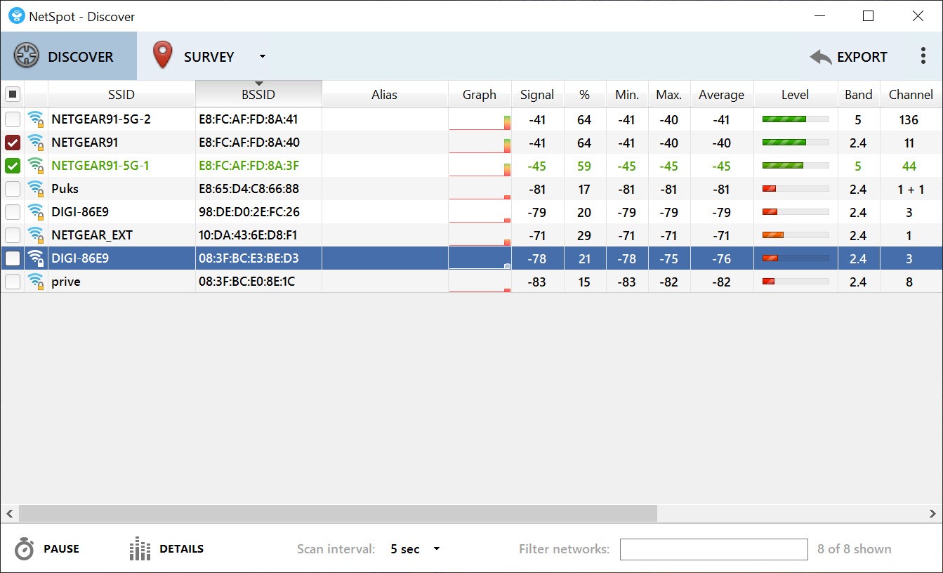
There are really two tools bundled into one here. The first is a quick scanner that lists every wireless network in range along with its signal strength, channel, band, and security type. The second is the survey mode that produces those heatmaps.
Together they cover both the fast “what’s around me right now” question and the deeper “why is my coverage uneven and how do I fix it” investigation. For anyone troubleshooting a flaky connection or planning where to put a router, that combination is the whole appeal.
It is the kind of tool that looks technical but pays off immediately. One survey often reveals a dead zone you had been blaming on your devices, when the real culprit was a thick wall or a router tucked in the wrong corner.
What’s in the air around you
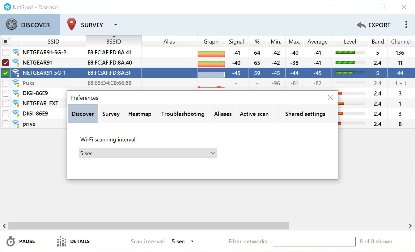
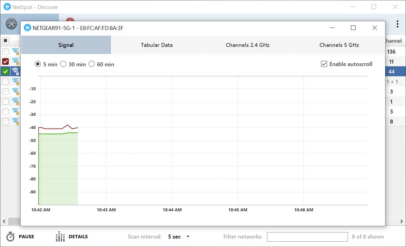
The discover mode is the part you will reach for most often. NetSpot scans the area and lists every detected network with the details that matter. You see signal strength in real numbers, which channel each network sits on, whether it is running on the 2.4GHz or 5GHz band, and what security each uses.
Why does this matter? Because Wi-Fi problems are frequently interference problems. If your neighbors and you are all crowded onto the same channel, your speeds suffer no matter how good your router is. The scan shows you that crowding plainly, so you can switch your router to a quieter channel and reclaim performance. For ongoing, lightweight monitoring of the networks around you, a tool like Acrylic Wi-Fi covers similar ground, but the survey side is where this application separates itself.
Seeing coverage across a whole space
This is the standout feature. You upload a map of your home or office (a floor plan, a sketch, even a rough drawing), then physically walk the space, clicking your location on the map at each spot. At every point, NetSpot records the signal it measures. When you finish, it stitches those readings into a visual heatmap laid over your floor plan.
The result is genuinely useful. Strong areas glow green, weak ones fade to red, and the dead zones show up as gaps you can point at. Suddenly the abstract complaint of “the Wi-Fi is bad upstairs” becomes a specific, mappable fact. You can see that the signal is fine until it hits the staircase wall, then drops off a cliff. That tells you exactly where to add an access point or extender, rather than buying gear and hoping.
It does not stop at raw signal either. The surveys can map several different metrics, so you are not just looking at strength but at the fuller picture of what your wireless environment actually looks like across the floor.
What the surveys actually measure
Beyond plain signal level, the survey mode visualizes things like signal-to-noise ratio, interference from overlapping networks, and how well coverage from different access points overlaps or leaves gaps. Each of these gets its own heatmap view, so you can flip between them and diagnose a problem from multiple angles.
This is where it earns its keep for anyone with more than a single router. If you run several access points, the overlap maps show you whether they are cooperating or fighting, and whether there is a corridor where neither one reaches well.
For a simple one-router home that may be more detail than you need, but for a larger space, it is the difference between coverage that works and coverage that has mysterious cold spots.
Putting the findings to use
A survey is only worth doing if it changes what you do next, and that is where NetSpot tends to deliver concrete answers. Found a dead zone behind a brick wall? You now know to relocate the router or add an extender on the near side. Saw heavy channel overlap with neighbors? Change channels and re-scan to confirm the improvement. The measure-change-remeasure loop is the practical heart of using it well.
It pairs naturally with whatever you do about coverage afterward. If part of your fix involves sharing a connection or setting up an additional access point, something like Connectify Hotspot handles that side, while this tool stays focused on the measuring and mapping.
And for quick spot-checks between full surveys, a real-time monitor such as Homedale can keep an eye on signal at your desk without setting up a whole survey again.
Conclusion
For anyone serious about fixing or planning Wi-Fi coverage, NetSpot is one of the clearest tools for the job. The quick scan handles everyday questions about nearby networks and channel crowding, while the heatmap surveys turn vague complaints about bad coverage into a precise map that tells you what to change and where. That visual payoff is what makes it worth the setup effort.
It is not the lightest tool to use, and a single-router household may find the full survey depth more than it strictly needs. But for larger spaces, multi-access-point setups, or anyone tired of guessing why one room never connects, this application gives you the answers in a form you can actually act on. Measure, adjust, measure again, and the dead zones tend to disappear.
Pros & Cons
- Visual heatmaps turn invisible coverage problems into a clear map you can act on
- Quick scan lists every nearby network with signal, channel, band, and security
- Surveys map multiple metrics including interference and signal-to-noise, not just strength
- Reveals exactly where dead zones are so you place extenders and access points sensibly
- Measure-change-remeasure workflow confirms whether your fix actually worked
- Full surveys take time and effort, walking the space and marking each point
- Multi-metric depth is more than a simple single-router home usually needs
- Accuracy depends on having a reasonably correct floor plan to work from
- Interface leans technical and can feel dense for first-time users
Frequently asked questions
It shows both a live list of nearby networks (with signal, channel, band, and security) and visual heatmaps of your own coverage across a floor plan, so you can see exactly where signal is strong, weak, or absent.
You upload a map of your space, then walk through it clicking your position at each spot. The application records the signal at every point and combines those readings into a color-coded heatmap laid over the floor plan.
Yes, that is one of its main uses. The heatmap makes dead zones appear as clear gaps on the map, which tells you precisely where to add an extender or move your router instead of guessing.
No. Alongside signal strength it can map metrics like signal-to-noise ratio and interference from overlapping networks, each as its own heatmap, so you can diagnose problems from several angles.
Yes. The scan shows which channels nearby networks occupy, so you can spot crowding and switch your router to a less congested channel, then re-scan to confirm the change helped.


